SEKO Warehouse Management System
-
Seko is a Global logistics and supply chain management delivering award-winning Ecommerce Solutions. As part of a wide remit to address the user journeys around the Warehouse Management System, and overhaul of working design methodology was required in order to create a more enaging scalable product.
-
The objectives of this project were as follows:
1) To provide a holistic review of the WMS and reassess the user flows.
2) To Introduce a compontentised design system to improve the scalability and consistency of the product.
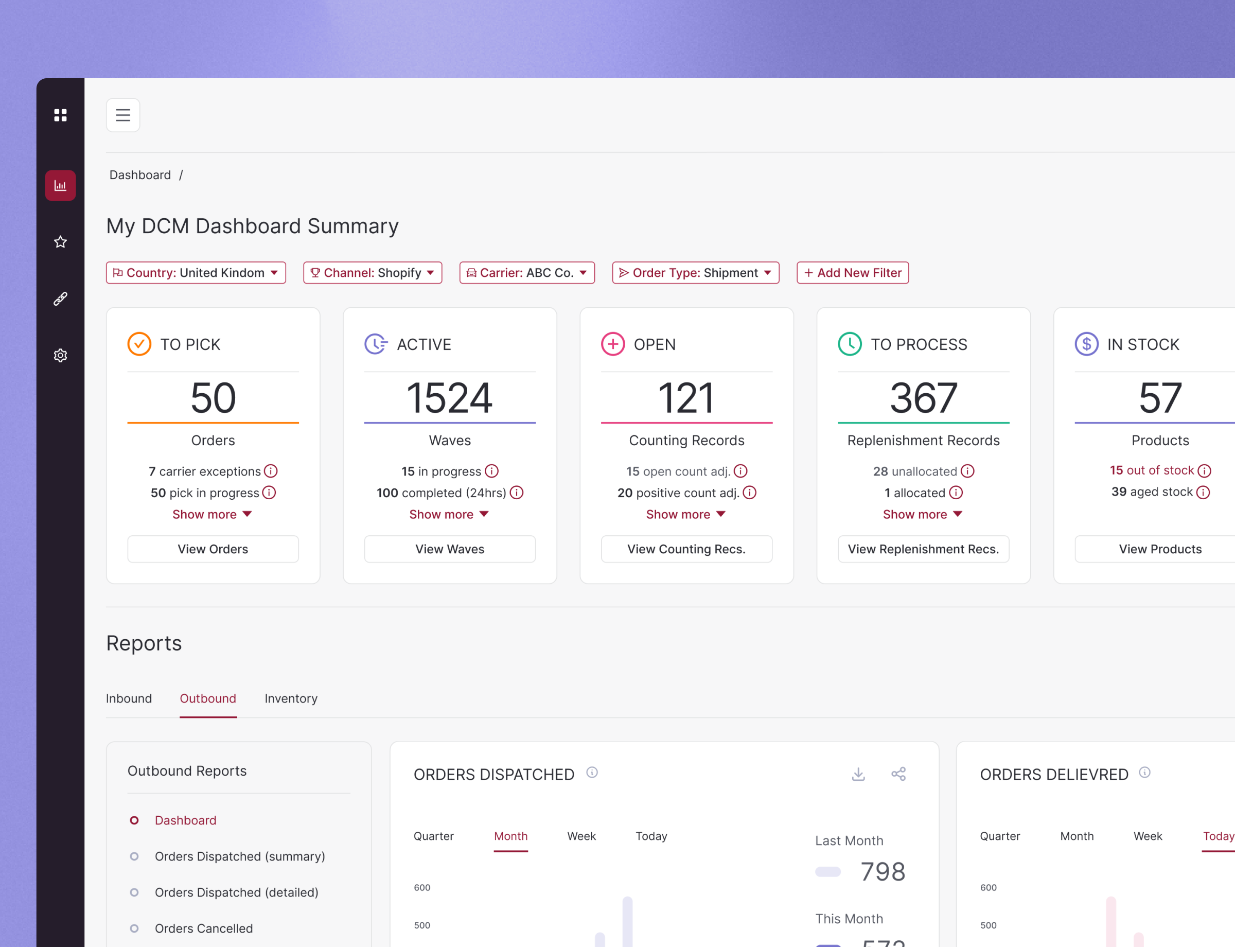
3) To surface easily digestable data on a dashboard and provide a visually engaging experience.
4) To develop the Search function and deliver a fast, powerful, focussed feature.
5) To develop the brand experience throughout the platform reviewing colour, typography and brand marque.
A holistic review

Initiated the project with a comprehensive usability audit of the existing platform, employing heuristic evaluation, user interviews, and performance analytics to identify friction points. This audit revealed significant areas for improvement, particularly in the platform's navigation system, data views, and search capability.
Design Strategy
Formulated a redesign strategy that prioritises a simplified user flow, enhanced data visualisation for warehouse data, and new features to engagement among users. Developed a detailed design roadmap, categorising changes into short-term fixes and long-term enhancements, to guide the redesign efforts effectively.
Design Development
Wireframing
Undertook the redesign of core screens and user flows, addressing the audit's findings. Emphasised the creation of a more intuitive and goal-oriented user journey, reducing cognitive load and enhancing the overall user experience.
High-Fidelity Prototyping
Leveraged Figma to construct detailed prototypes that brought the new design to life. These prototypes featured a refined aesthetic that aligns with the requirements of different hierarchy of users, showcasing the platforms enhanced functionality and interactivity.
User Interface Design
Revamped the platforms visual identity, incorporating a more modern colour palette and dynamic elements that empathise with the users daily requirements in managing workflow. Carefully selected typography and iconography that resonated with the app's target demographic, ensuring the interface is not only beautiful but also functional.
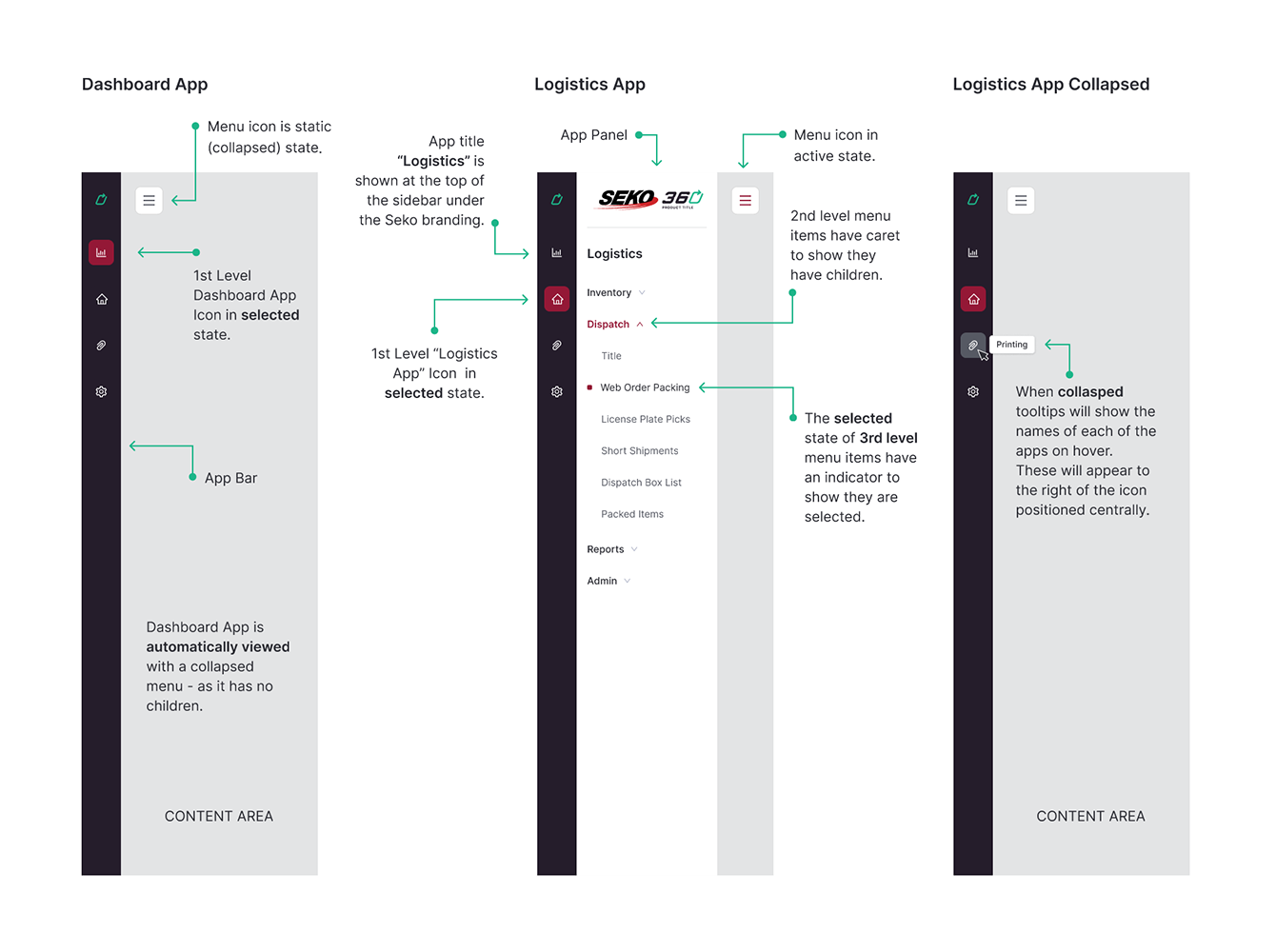
Workflows
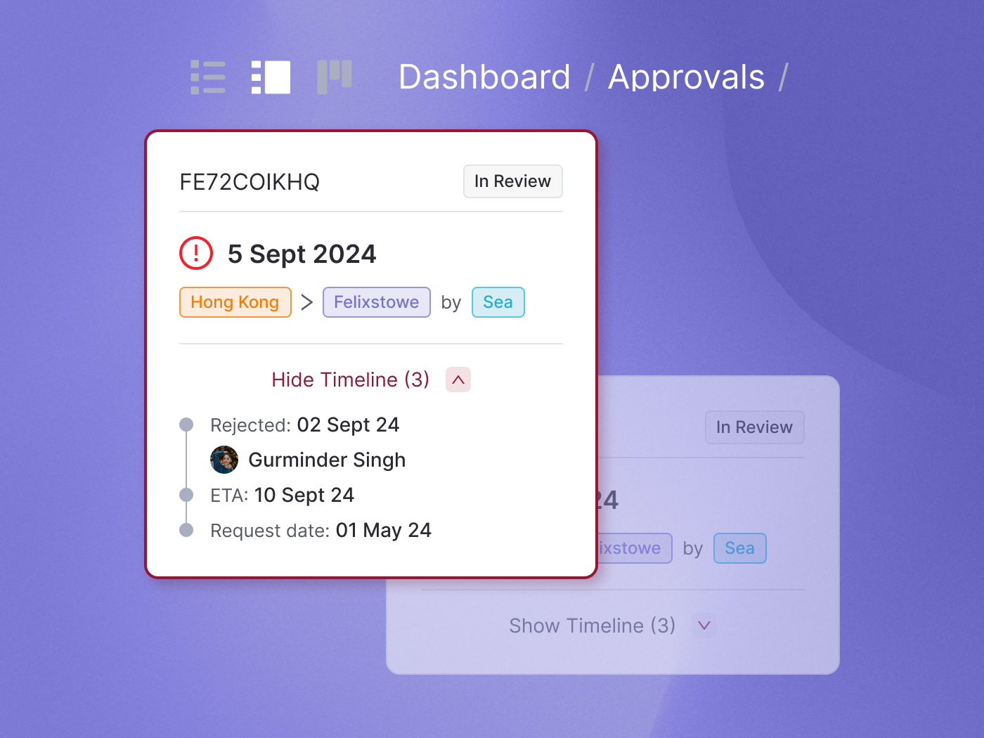
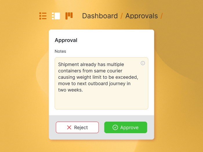
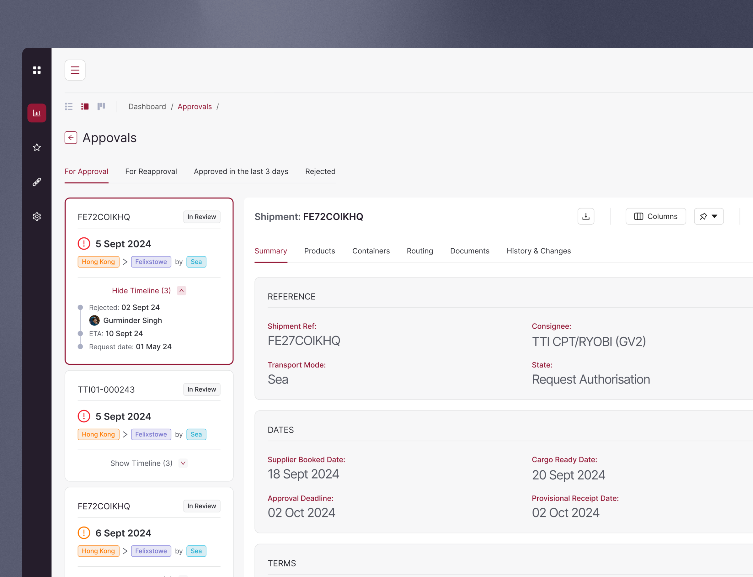
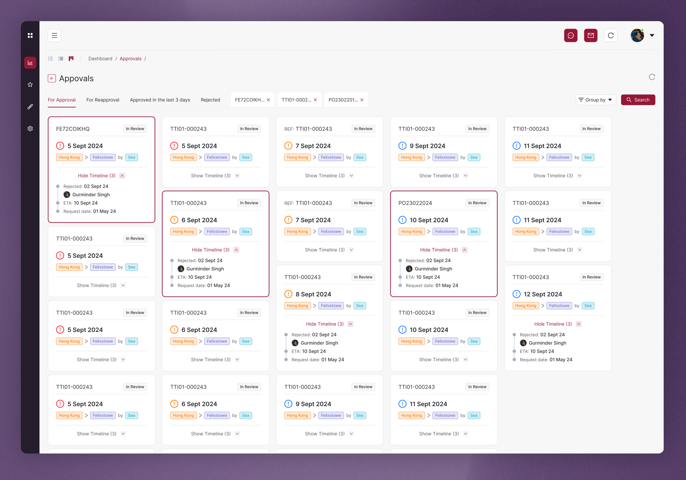
One of the key aspects of the redesign was how to visualise the Approvals workflow. The previous structure was a table-only view with a model pop-up which forced the user into excessive clicks to achieve a result which will be repeated x100’s on a daily basis. The importance of giving the user multiple view options was key to improving the workflow. By adding a list view with Cards for the shipments the user was able to navigate a list whilst still viewing key data and making a decision in one view, therefore reducing the number of clicks required to do so. The Kanban view also provides a better overview of the task list.
The power of actions
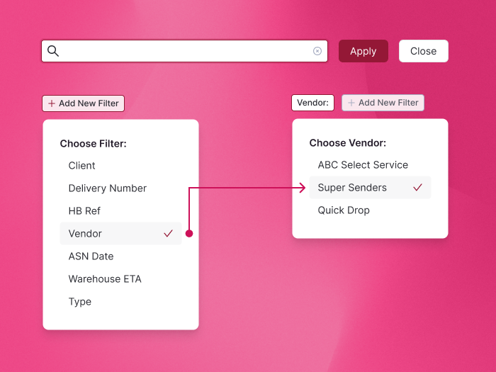
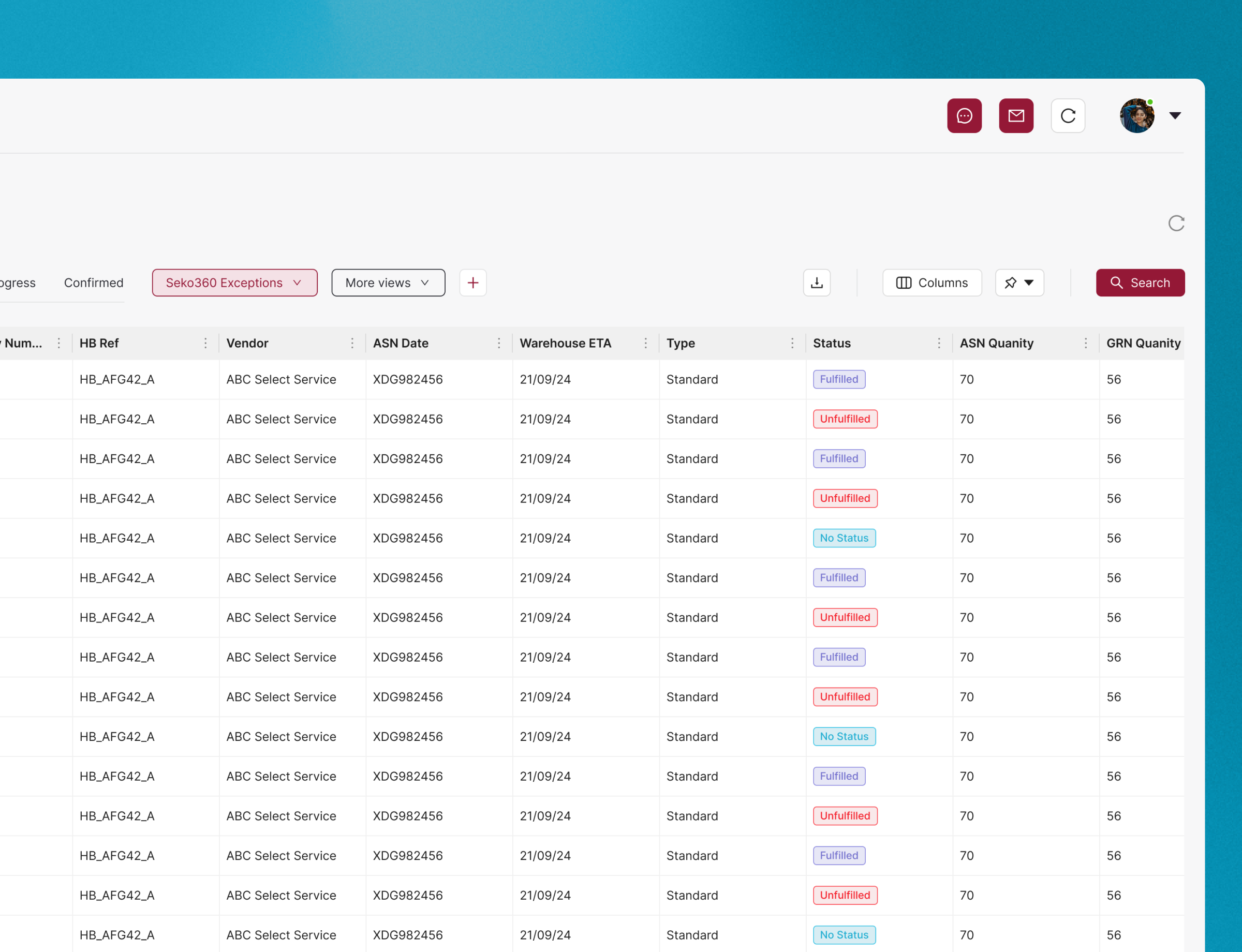
Another key aspect of viewing a data heavy platform is there power of actions. From setting the column order, pinning and saving a grid setting, through to adding personalised views and searching and refining the result with powerful filters. This was achieved with prototyping and user testing sessions and setting up typical work day scenarios and reviewing friction points.


User Testing & Implementation
Facilitated user testing with a diverse group of app users, gathering insightful feedback on the redesign. This phase was crucial in identifying unforeseen usability issues and validating the effectiveness of the new design elements. Iterative refinements were made based on this feedback, fine-tuning the app's interface to maximize user satisfaction and engagement.
Collaborated closely with the development team to ensure a smooth transition from design to implementation. Provided ongoing support and guidance during the development phase, addressing any design-related challenges that arose.


Final thoughts
The redesigned Warehouse Management System received overwhelmingly positive feedback from users, who praised its improved usability, engaging design, and enhanced features. The project was a significant learning opportunity, enhancing my understanding of user-centric design principles and the impact of design on user behavior and retention.
